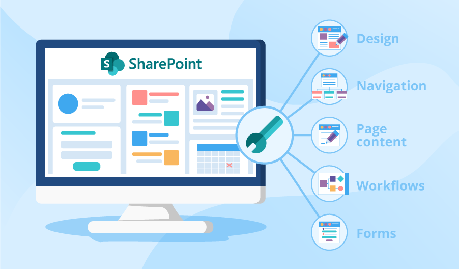
The strategic use of asymmetrical page elements adds visual interest to SharePoint sites.
Thoughtfully imbalanced designs command user attention while lending sites a modern, sleek aesthetic.
This article explores tips for incorporating asymmetric layouts to boost SharePoint engagement through compelling imbalance and hierarchy.
SharePoint for document management capabilities make it a popular intranet and team site platform. However, its out-of-the-box templates often lack creative flair.
The Power of Asymmetrical Balance
Asymmetrical (or asymmetric) layouts incorporate intentional imbalance to create hierarchy, focus, and movement.
Unlike symmetrical designs where elements mirror each other on both sides, asymmetrical pages utilize offset placements and size variations to direct attention. Thoughtful asymmetry adds dynamism while enabling designers to emphasize key content.
Core Asymmetrical Layout Concepts
Contrast – Contrast focuses a user’s gaze by varying element sizes, colors, positions, etc. Strong differences naturally draw the eye. For example, placing a large announcement banner amidst multiple smaller content blocks.
Whitespace – Whitespace (or negative space) lets other elements breathe while facilitating scanning. Different element sizes and uneven spacing add whitespace.
Scale – Scaling page elements to different dimensions (large type vs small buttons) creates visual weight Differences for hierarchy.
Overlaps – Layering page elements on top of one another adds depth while linking disparate components. For example, overlapping a large hero image behind site navigation.
Asymmetrical SharePoint Design Tips
- Vary Section Sizes – Size page web parts and sections unequally so certain content catches the user’s eye first.
- Offset Navigation – Position the quick launch bar asymmetrically for some imbalance.
- Overlay Branding – Splash engaging imagery behind menus and headers to blend sections.
- Feature Key Content – Make important updates prominently larger than supplementary info for contrast.
- Embrace Whitespace – Use generous negative space between asymmetric elements so key pieces stand out.
- Mix Wide and Narrow Columns – Blend column widths in varying combinations to avoid rigid uniformity.
Here are some easy ways to start introducing asymmetry across SharePoint pages and layouts:
Homepages
- Float the site logo left while right-aligning primary navigation
- Set a large banner image overlaid behind page title and description
- Populate a wide web part beside multiple stacked narrow components
Document Libraries
- Position library title on the right with a description on the left
- Show key metadata on the left with preview pane beside/below
- Use alternate background colors for every other row
Team Sites
- Overlap navigation bar atop a background image
- Populate different web part widths and placements per section
- Vary font sizes/styles across H1, H2 and normal text

Benefits of Asymmetrical SharePoint Designs
- Visually Engaging – Asymmetry intrigues users through deliberately contrasting layouts.
- Creates Hierarchy – Varying scale and space spotlights vital information first.
- Guides Scanning – Differences prompt visual flow across key content.
- Modern Aesthetic – Fragmented, overlapping elements feel current and stylish.
- Encourages Interaction – Compelling imbalance draws users in to click and explore.
Rather than rigidly symmetrical layouts, asymmetrical pages add excitement while enabling intuitive workflows.
SharePoint sites feel fresh and modern with strategic imbalance guiding visitors to key functionality.
By embracing negative space, content weighting, irregular alignments and varied proportion, designers craft interfaces that engage users while elevating platform capabilities.
Asymmetrical concepts breathe new vitality into SharePoint, showcasing its strengths as an indispensable hub for document management and team productivity.

